Update 2022-06-25
DragonSlide » Devlog
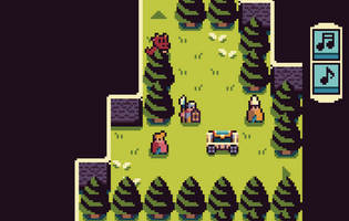
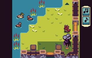
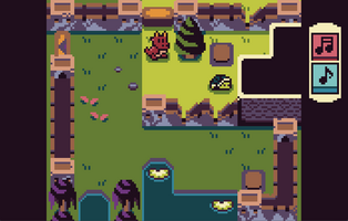
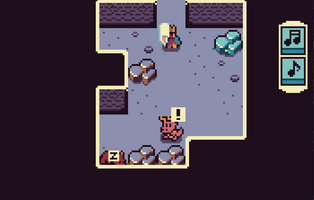

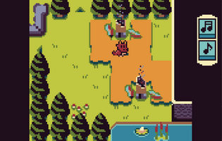
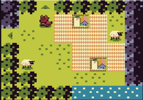
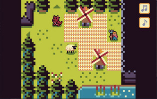

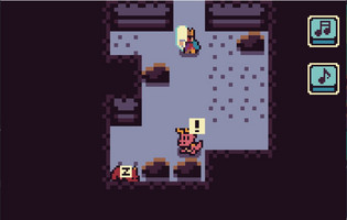
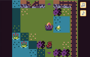
There have been a month since the last update, in where I updated the games art, as well as added much more content. This time I have once again updated the art, turning everything that was previously in an 8x8 format into 16x16, which was ALL of the enviromental/building art. I have also gone through and ironed out some problems I found in the game relating to the script and in game buggy behavior. I don't plan on updating DragonSlide further than this, though I thought the same thing after my last update, but people had pointed out that the mixture of 8x8 and 16x16 looked janky and so I decided to redo all of the art for the game.
I have also included some pictures from older versions after the newest ones
Files
DS.HTML5.zip Play in browser
Jun 25, 2022
DragonSlide
| Status | Released |
| Author | FloatingOer |
| Genre | Adventure, Puzzle |
| Tags | Dragons, Exploration, Fantasy |
More posts
- Update 2022-06-26 Small fixesJun 26, 2022
- Complete OverhaulMay 27, 2022
- Update 2022-02-10Feb 10, 2022
Comments
Log in with itch.io to leave a comment.
Great update! When we talked about pixel sizes, I wanted suggest making environmental sprites 16x16 but keep them at a lower contrast, so the important elements would still be clearly visible. But I didn't have time to create an example of what I meant by that :D You did it anyway, and kudos for tackling that huge makeover. The result is a huge improvement!
Thanks for the compliment! The only real contrast is that the character art (and the wagon/insects) have a dark outline, I suppose this is what you meant? The thing I'm missing is some form shader distortion for the water and for the smoke after destroying buildings, but that's a bit much for me to figure out at the moment. Did you play through the game again to see all the new artwork?
Yes the dark outline works very well. What I had i n mind was keeping very dark/black and saturated colors only for characters and actionnable items, and "muted" tones for environment. Here's a quick n'dirty mockup. Not sure it would work for the whole game though, it is a very different look, and I probably went too far to illustrate here, especially for the grass :D
Hmm that's an interesting idea, muting the background. I'm not going to redo all the art again now though, I already did that twice now haha. But I can see how it could benefit in bringing more attention toward the important parts. Currently I'm mulling over what game to make next, I'm considering making a series of games set in the same world as this one with new and reoccurring characters, this way I can reuse most stuff game->game with new twists to the base mechanics and only need some new art for the specific games. So more polished games for less effort xD